
Being digitally literate means being critical, analytical and understanding of communication medias. As a live music photographer a consciousness of the different elements that make up a scene is important as photographer’s main aim is to preserve a moment in time. This assignment has bought to my attention these elements and through digital reproduction I have reached the final conclusion of my final image.
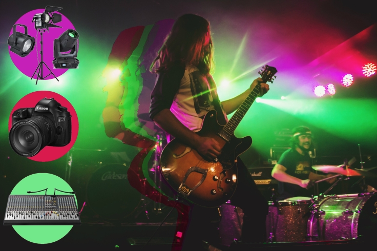
The original, a shot of the lead guitarist from Jackson Firebird mid headbang in a passionate, energetic performance with his other band mate expressing elation to the background of the image. I chose this image as it reads centre to margin (Kress et al. 1996 pp. 206). The guitarist is most salient as he is the largest, most focused element of the photo. I like the structure of status within the photo with the drummer as the “long shot” and the guitarist as the “medium shot” clearly defining him as the most important (Kress et al. 1996, pp. 181). Also the backdrop of the colourful lighting highlights his presence within the photo furthermore. The viewer then tends to look to the margin which falls to to the right of the guitarist with the drummer. This compliments the scene as his expression accurately represents the general atmosphere and feelings that were manifest within the performance. As a whole I thought it was an eye catching, expressive depiction of the vibrant spirit of live music performance which was what I found most effective in exploring my concept of the intersectionality of technical and art disciplines when producing a live music performance.
The centre to margin reading of the image allowed the space on the left for extra images that I could include to further recitify my concept. Whilst I was thinking that images of to the left might be too salient and would take attention away from my desired punctum of the image. Although I think my colourful outlining of the guitarist further emphasises his presence as the most eye-catching component of the image.
My placement of elements within the image each has different coded elements that make up the meaning of my photo. I have used the framing element of the colourful circles which are coloured with colour samples from the lighting to further iterate the theme of importance of lighting. The circle frames disconnect the cropped images from the rest of the photo defining it as an independent element. Although, the cropped images fall outside the borders of the circle it conveys it’s unification with the themes of the image. I also think it is symbolic of the unification of elements being, photography, sound engineering and lighting with live music performance an the musician. The colour theme is perpetuated throughout to create an asthetic theme to the image.
The guitarist is the central meaning for the presence of the other elements of photography, sound engineering and lighting hence why I have chosen such a layout to convey my ideas of the convergence of these specialities. “Dominant centre flanked by relatively polarised elements.” (Kress et al. pp. 206) The guitarist is a unification of the meaning that it is surrounded by.
It is an ethical photo to use as it was taken by myself for a magazine which gave a media pass that allowed me permission to take photos of the event. Which also means by rights I’m allowed to take photos of the musician. As for the cropped images to the left of the image I have effectively referenced them in my blog posts and exegesis.
As for my final image I did not do a lot more to further edit. Under the guidance of my tutor I added some text to clarify the meaning within the image. I came up with the idea of “one moment, infinite elements” obviously meaning that there are many elements that make up a single moment in live music perfromance. I chose a light grey colour for the font as it was placed bottom right (still adhering to the centre-margin reading of the image) to make it stand out against the dark background. The font I chose merely because I liked it and found it easy to read. I had a lot of difficulty coming up with the logo and trying to change the size of the font. I then added a slight vignette to frame the elements the photo as one.
References:
Kress, G. & Leeuween, T. 1996, ‘The meaning of composition’, Reading Images: The Grammar of Visual Design, Routledge, London, pp. 188 – 229

Leave a comment